Start with what the color does, not what it is called
A shirt, collar, scarf, or jacket lapel sits close enough to your face to shape your first impression of an outfit. That does not mean every person has one correct set of colors. The effect depends on more than a shade name: its lightness, depth, brightness, fabric, and the colors beside it all matter. Two garments labeled “blue” may look entirely different in practice.
Instead of asking whether a color belongs to your season, ask what you notice when you wear it. Does it draw attention to your face, or does the garment command all the attention? Does the overall outfit feel balanced to you? These are styling questions, not tests with permanent answers. A color that feels too strong in a glossy top may be easy to wear as a faded cotton shirt.
Compare colors in a way that is useful
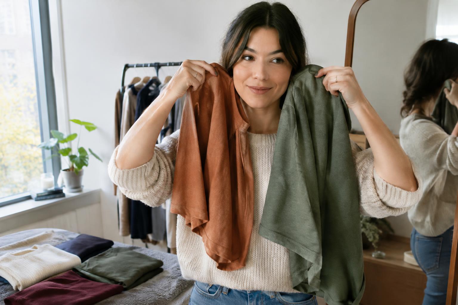
Try a quick comparison in indirect daylight, away from a strongly colored wall. Hold one top or scarf beneath your chin, then switch to another while keeping your hair and makeup, if any, the same. Compare two colors at a time rather than judging a whole wardrobe at once. For example, try cream against bright white, olive against charcoal, or soft blue against vivid cobalt.
Look at the full impression in a mirror, then step back. A phone photo can help you compare outfits, but camera settings and indoor lighting can shift colors, so treat it as a second opinion. Repeat the comparison on another day if you are unsure. The goal is not to inspect every feature of your face; it is to learn which combinations make getting dressed easier.
Keep the garment’s purpose in mind. You might prefer a quiet color for a workday shirt and a bolder one for a dinner outfit. Both preferences can be useful. If you consistently reach for a particular shade, that is information too, even if a palette guide would place it elsewhere.
Use contrast as a flexible styling tool
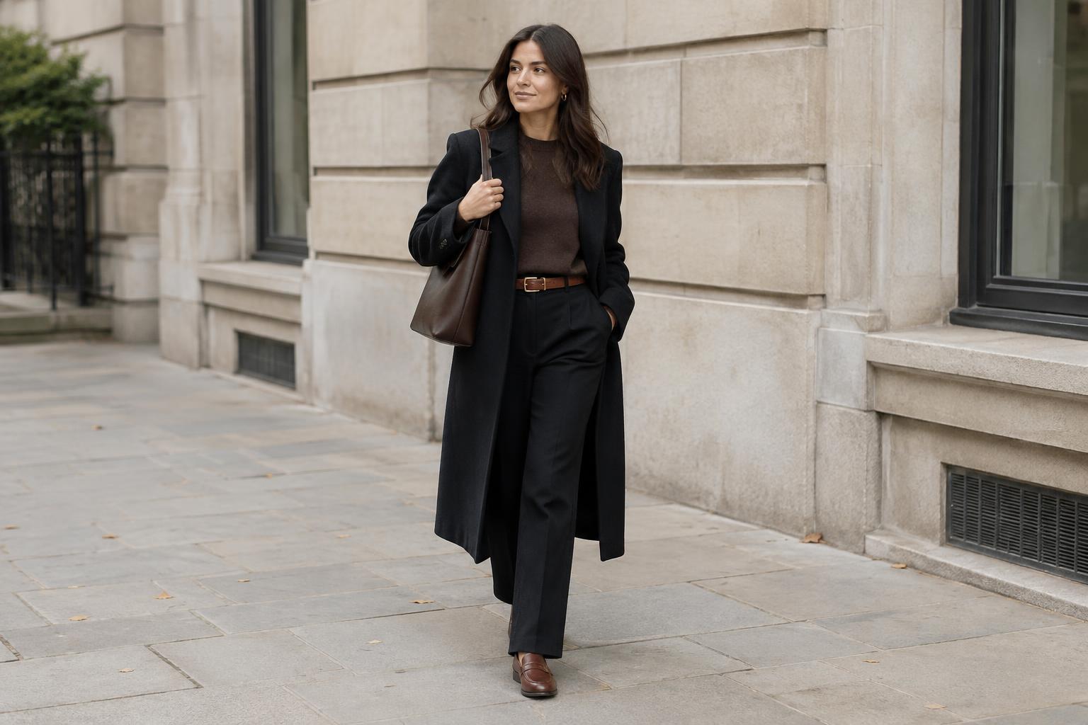
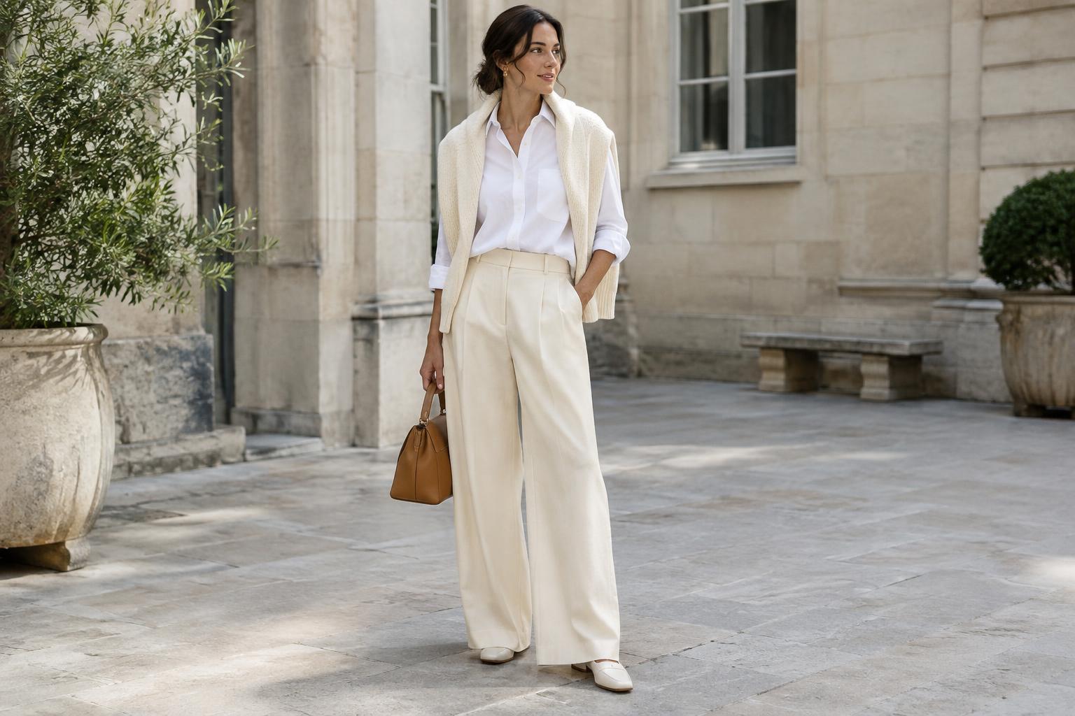
Contrast is the difference between colors placed together. A black turtleneck against a light face creates a sharper effect than a pale gray one; a deep brown jacket over a cream shirt creates more contrast than brown over tan. Neither approach is automatically better. Sharp contrast can look crisp and deliberate, while a closer range of tones often feels softer.
If a color near your face feels overwhelming, you do not always need to remove it from your wardrobe. Break it up with a neckline that shows some skin, leave a collar open, or put a more comfortable color between your face and the garment. A white shirt under a vivid sweater, for instance, changes the effect of the sweater at the neckline. If an outfit feels too quiet, try the reverse: add a brighter scarf or a darker collar to give it a clearer focal point.
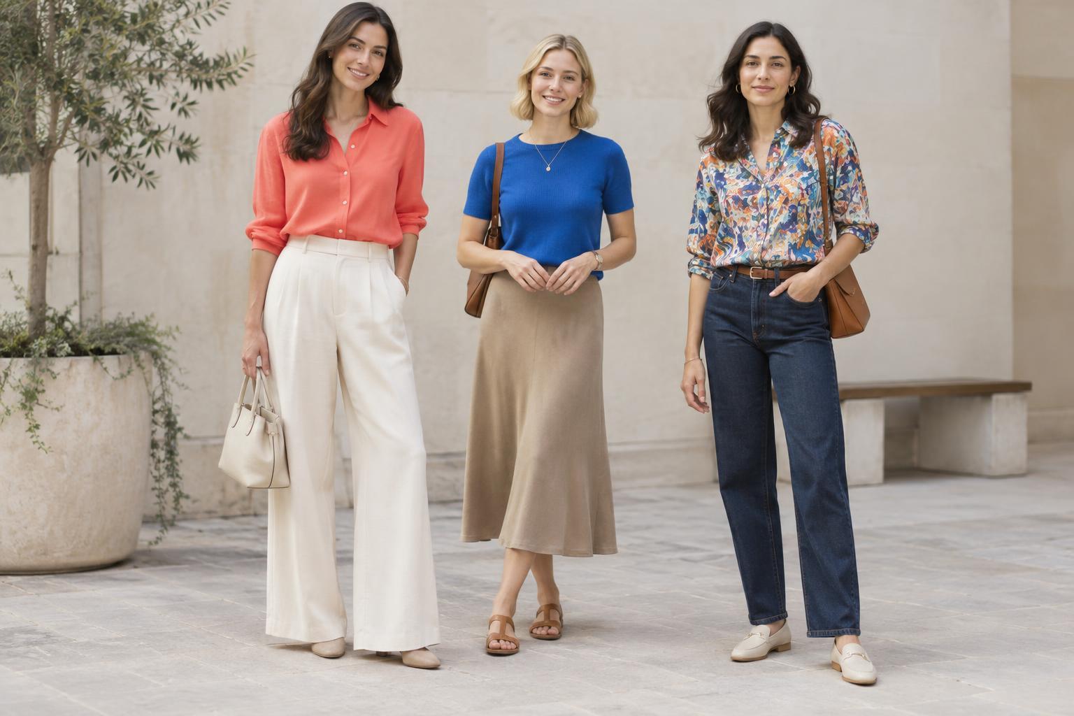
Prints offer another middle ground. A patterned blouse that includes both a favorite neutral and a challenging bright color may be easier to wear than a solid block of that bright color. The scale of the print matters as well: small marks can read as texture from a distance, while large shapes make a stronger statement.
Pay attention to fabric and nearby accessories
Color is not separate from texture. Matte linen, brushed knitwear, smooth silk, and shiny satin reflect light differently, even when they are similar shades. If a color looks harsh in one fabric, test a softer or less reflective version before deciding it is not for you. Wash and wear can also change a garment’s appearance, so compare items as they actually look in your closet rather than relying only on a color name online.
Accessories let you experiment without rebuilding an outfit. A scarf can bring color directly to the face; earrings or glasses can add a smaller accent. Try a navy outfit with a rust scarf, then a pale blue one, and notice how each changes the mood. If you love a color but prefer it away from your face, use it in trousers, a bag, or shoes. Enjoying a shade does not obligate you to wear it as a top.
Build a personal palette you can actually use
Choose a few near-the-face colors you enjoy repeating: perhaps one light neutral, one dark neutral, a subdued color, and a brighter accent. These are starting points, not limits. Check that they work with bottoms and outer layers you already own. A color is especially useful when it helps you make several outfits, not just when it looks appealing on a hanger.
As you dress over time, notice which tops need little effort and which require a particular scarf, jacket, or lighting to feel right. Keep the helpful combinations in mind when shopping or packing. Your palette can change with your taste, hair color, wardrobe, or the setting you are dressing for. The most practical rule is simply to compare real garments on yourself and make room for colors you like.