Start with the opposite side of the wheel
A color wheel arranges hues in a circle, making it easy to see how they relate. Complementary colors sit opposite one another. On a traditional style or painting wheel, familiar pairs include blue and orange, red and green, and yellow and violet. Placed together, these colors create noticeable contrast. That does not mean you have to wear their brightest versions: navy and rust, burgundy and olive, or pale yellow and muted lavender can express the same idea more quietly.
Start with one garment you already own, such as a blue shirt or a green skirt. Find its general color family on the wheel, then look across to identify a possible partner. Treat the wheel as a starting point rather than an exact shopping list. Color wheels can differ, and fabric colors rarely match a printed diagram perfectly. The useful question is whether the two pieces create a contrast you enjoy wearing.
Let one color lead
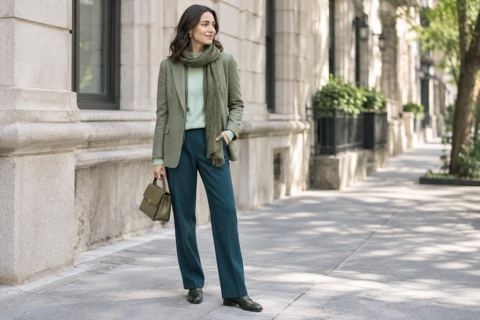
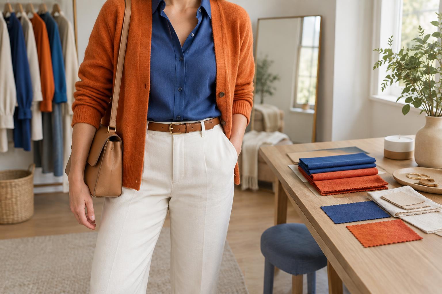
Two equally bright complementary colors can compete for attention, especially when both cover a large area. An easier everyday approach is to give one color the main role and use the other sparingly. A navy dress with a rust belt or bag keeps the blue dominant while the orange-toned accent adds energy. A forest-green jacket over a burgundy top gives both colors more room, but the darker shades keep the contrast softer than vivid red and green would.
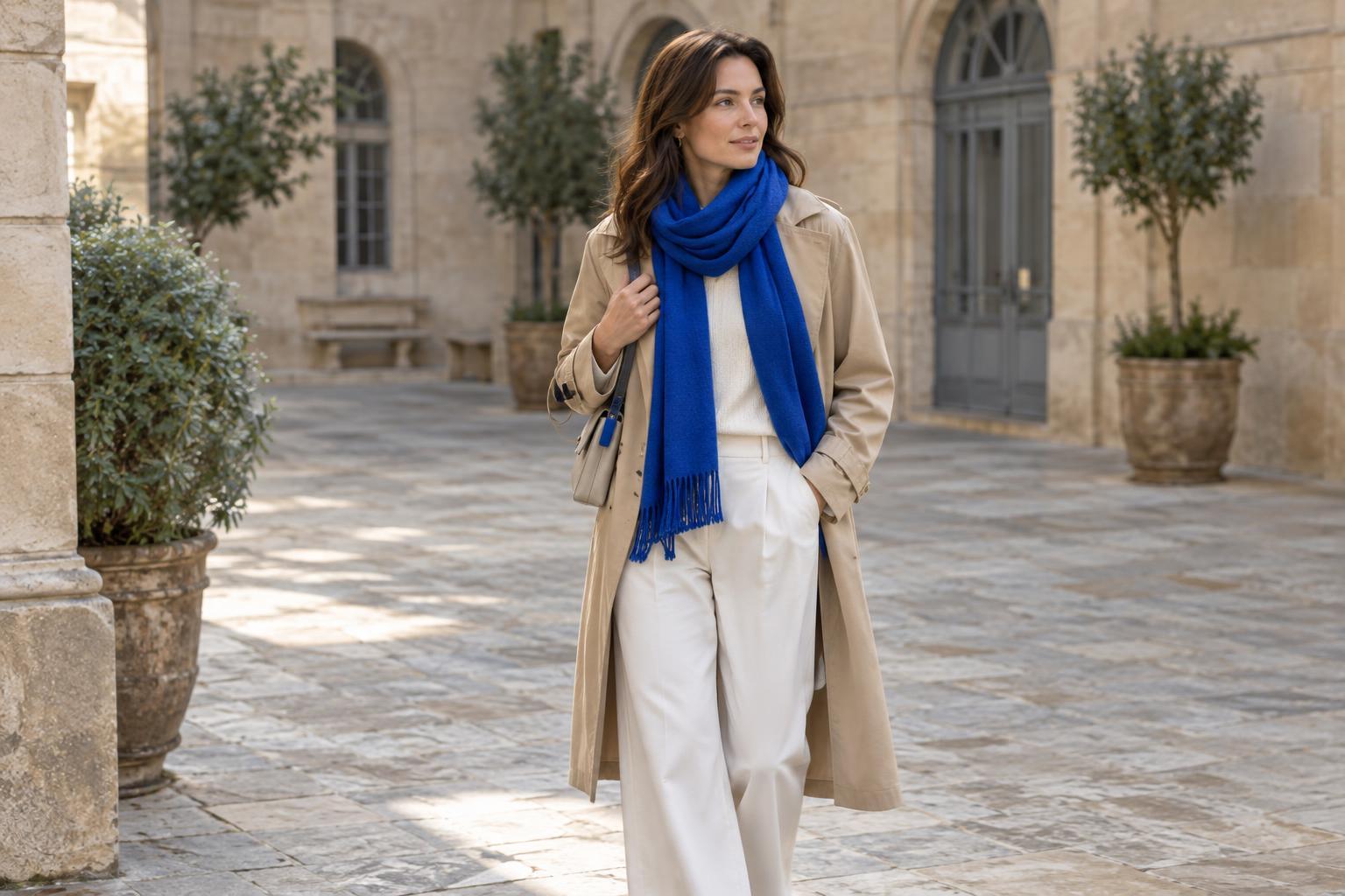
Think about where you want the eye to go. A contrasting scarf draws attention toward the face; colorful shoes can add interest to an otherwise simple outfit. If an accessory feels too small to connect with the rest of the look, repeat its color once in a subtle detail, such as a print, hair accessory or pair of socks. Repetition can make the choice feel intentional without requiring a perfectly matched set.
Adjust brightness and depth
A complementary pairing describes the relationship between colors, not how bright or dark they must be. For a relaxed look, choose subdued versions of both hues: dusty blue with terracotta, sage with soft rose, or mustard with plum. If you prefer stronger color, try a vivid accent against a deeper base, such as an orange knit under a dark blue coat. Changing the depth or intensity of either piece can make a difficult pairing easier to wear.
Fabric also affects the result. A glossy surface may make a color appear more prominent than the same hue in a matte cotton or wool. Texture can soften contrast, too: a chunky violet sweater with pale yellow trousers often reads differently from two crisp, smooth pieces in the same colors. When deciding whether a pair works, look at the actual garments together rather than relying only on color names.
Use neutrals to give the colors space
Neutral pieces help separate complementary colors and make them simpler to repeat in everyday outfits. Try blue jeans, a white shirt and a warm orange scarf. The jeans and scarf provide the color relationship, while the shirt gives each room to stand out. With an olive skirt and a muted red top, a cream cardigan can soften the transition. Black, gray, brown and denim can play a similar supporting role, depending on the mood you want.
Patterns offer another low-commitment way to experiment. A printed shirt may already contain a small amount of the color opposite your trousers or jacket. Pick up that detail with one other item, or let the print do all the connecting. You do not need to add every color in a pattern to the rest of your outfit.
Check the outfit, not just the theory
Before choosing a new piece, try the combination with clothes you own and look at it in ordinary daylight when possible. Compare a few options: a brighter accent, a softer shade, or a neutral layer between the two colors. Notice whether the pairing feels right for where you plan to wear it. A contrast that is fun for a weekend outfit may feel too bold for a setting where you prefer to blend in.
The color wheel is most useful when it expands your options rather than imposing a rule. If blue and orange feel natural to you but red and green do not, start with the pair you enjoy. Over time, small experiments with scarves, socks or bags can show you which complementary colors suit your wardrobe and which ones you would rather leave on the wheel.