Start with a lead color
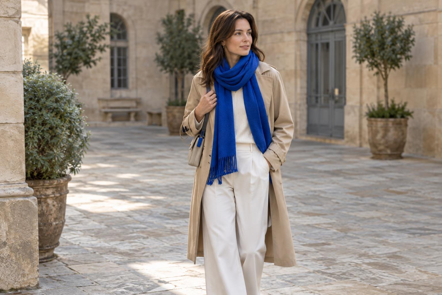
Wearing two bold colors is easier when they do not compete for equal attention. Choose one to cover more of the outfit and use the other as an accent. A cobalt sweater with a narrow red belt, for example, reads differently from a cobalt sweater with red trousers: the belt adds a vivid point of interest, while the trousers make the pairing the main event. Neither approach is wrong, but deciding which color leads gives you a starting point.
If you are new to the combination, begin with one bold garment and one smaller item, such as a bag, scarf or shoes. Once you like the pairing, try increasing the accent color with a cardigan or skirt. You can make that change without rebuilding the entire outfit.
Give the colors separate jobs
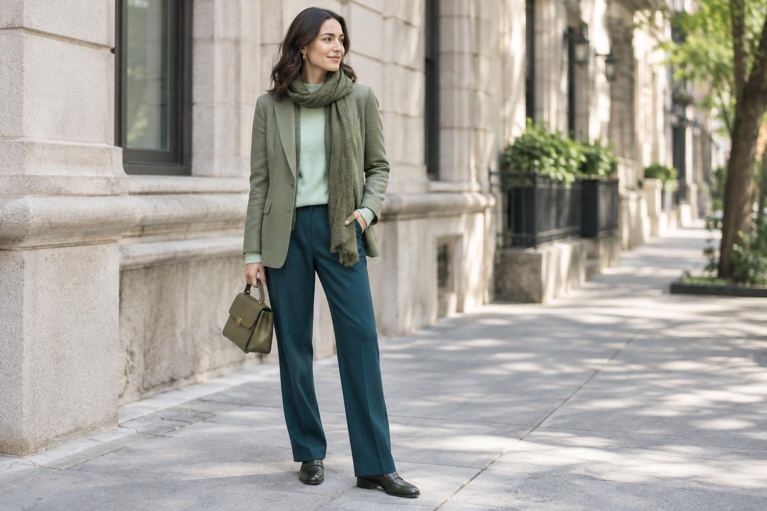
Placement can make an energetic combination feel orderly. Try keeping one color on your upper half and the other on your lower half, or let one color appear in your clothes and the other in a single accessory. A tomato-red shirt with deep pink trousers creates a broad sweep of color; adding a plain belt or leaving some space at the neckline can help define the pieces. A green dress with an orange bag keeps the second color contained.
Think about where you want the eye to go first. A bright jacket naturally draws attention near the face, while saturated shoes put the accent farther down. You do not need to repeat both colors throughout the outfit. One deliberate appearance of each may be clearer than matching your earrings, bag and shoes to the same two shades.
Use a quiet element for breathing room
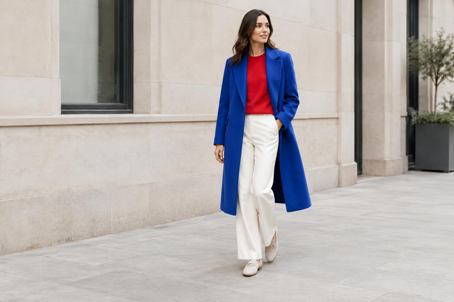
A neutral is useful, but it does not have to separate the bold colors completely. Dark denim beneath a violet top and a yellow jacket gives the eye a familiar resting place. Cream trousers can soften a blue-and-red combination, while charcoal or navy can ground brighter shades. Choose a neutral that suits the mood you want: lighter neutrals often feel airy, and darker ones tend to make the colors look more defined.
A quiet element can also be a simple silhouette. Straight-leg trousers, an unadorned knit or a clean-lined coat gives strong color enough room to stand out. If both pieces have elaborate shapes, prominent hardware and visible logos, the outfit may feel busy even when the colors work well together. Before adding another detail, look at what is already competing for attention.
Check the shades and textures together
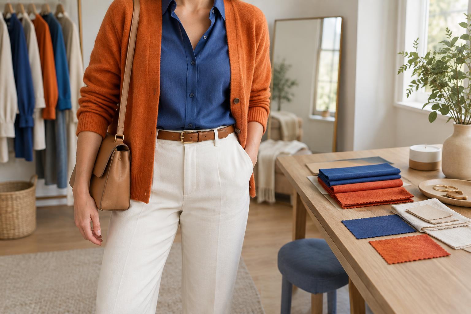
Color names alone do not tell you how two pieces will look side by side. An inky blue and a deep emerald may feel calmer together than an electric blue and a sharp lime. Likewise, warm orange can sit differently beside a reddish purple than beside a cooler violet. Hold the actual garments next to each other in ordinary daylight if possible, then decide whether you want a close, blended effect or a crisp contrast.
Fabric changes the impression too. A glossy blouse and shiny trousers reflect light in different places, which can amplify an already vivid pairing. If that feels like too much, combine one lustrous item with matte cotton, denim or a soft knit. Texture can provide interest without introducing a third strong color. A ribbed green sweater and smooth blue skirt, for instance, offer contrast while keeping the palette focused.
Finish by editing, not matching
Once the two colors are in place, choose accessories for their role rather than their ability to match. A practical tan bag, simple silver earrings or low-key shoes may support the outfit better than another bright piece. Pattern can work, but it is easiest to manage when it is small or when it repeats colors already present. A striped scarf that introduces several new shades asks the eye to process more at once.
Before heading out, look at the outfit as a whole rather than inspecting each item separately. If your eye moves easily between the two colors, you may be done. If several details demand attention at once, remove one accessory or swap one piece for a simpler version. The aim is not to make bold colors look subdued; it is to give them a clear place to shine.