Start by noticing the undertones
White and cream do not need to match exactly. In fact, a small difference can give an outfit depth that an all-white look may lack. The challenge is that “white” covers everything from crisp, cool shades to softer, warmer ones, while cream can lean toward yellow, beige, or pink. Before getting dressed, place the pieces side by side in daylight. Ask whether they look comfortably related or whether one makes the other appear unexpectedly gray or yellow.
If you are unsure where to begin, pair a warm white with a gentle cream. An ivory shirt, oatmeal-colored trousers, and an off-white canvas bag can sit together easily because none of them is sharply brighter than the others. A brilliant white shirt can also work with cream trousers, but the contrast will be more noticeable. Make that difference a deliberate part of the outfit rather than trying to pass the shades off as a perfect match.
Make the color difference look intentional
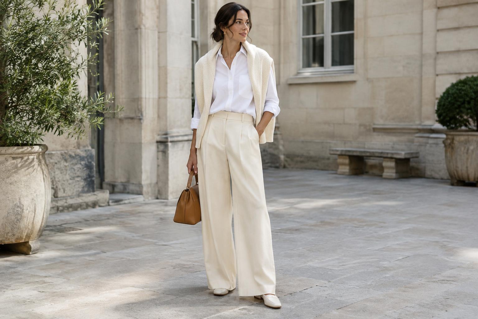
One simple approach is to give each shade a clear role. Let cream be the main color in a dress or pair of trousers, then use white for a smaller, distinct layer such as a T-shirt or open shirt. Alternatively, wear a white base and add a cream cardigan or jacket. Separating the colors into recognizable pieces helps the eye read the combination as styling rather than as two items that almost match.
You can also repeat a shade to connect the outfit. For example, white jeans and a cream knit feel more cohesive when a white collar peeks out beneath the knit. With a white shirt and cream skirt, a cream belt or scarf can echo the skirt. Repetition is useful, not compulsory: a single white piece and a single cream piece can look just as considered when their shapes and proportions work well together.
Use texture and shape for depth
Light colors show changes in fabric texture clearly, so take advantage of that. A smooth white cotton shirt against a cream ribbed knit creates contrast without introducing another color. Cream linen trousers and a structured white poplin top offer a different balance: the trousers look relaxed while the shirt gives the outfit definition. Denim, canvas, fine knits, and softly textured weaves can all provide variety within a narrow palette.
Shape matters, too. If both pieces are loose and pale, the outfit may feel less defined than you want. Try a tucked or half-tucked top, a visible waistband, or a shorter layer over wider trousers. If your cream piece is a fluid skirt, a neat white T-shirt can provide a clean outline. The aim is not to follow a fixed rule about fit, but to make it easy to see where one piece ends and another begins.
Choose accessories that support the palette
Accessories can either keep the look soft or give it a clear anchor. Tan sandals, a brown belt, or a woven bag add warmth to white and cream without pulling attention away from them. Black shoes or a dark bag create a stronger outline and can make a pale outfit feel more grounded. If you prefer a restrained look, choose just one darker accessory and let the rest stay close to the clothing colors.
You can also introduce a muted accent such as olive, soft blue, or faded rust through a scarf or bag. Keep it small if you want the white-and-cream pairing to remain the focus. Metal hardware, buttons, and jewelry affect the overall impression as well: warm-toned details tend to sit quietly beside cream, while cooler-toned details can emphasize a crisp white. Neither choice is wrong; look at the whole outfit rather than judging an accessory on its own.
Check the outfit in the light you will wear it
Indoor lighting can make cream look more yellow and bright white look harsher than they do outside. Once you have put the outfit together, take a quick look near a window if possible. This is especially helpful when combining several pale pieces, including shoes and a bag. If one item feels out of place, you may only need to move it away from a similar item or add a layer with a different texture.
Condition also influences how light colors sit together. A clean cream knit and a fresh white shirt can look intentionally different, while a dulled white shirt may make the contrast seem accidental. Follow each garment’s care label, treat marks before storing items when practical, and avoid assuming every pale fabric needs the same wash treatment. With a little attention to shade, shape, and care, white and cream become a flexible pairing rather than a matching problem.