What outfit contrast actually means
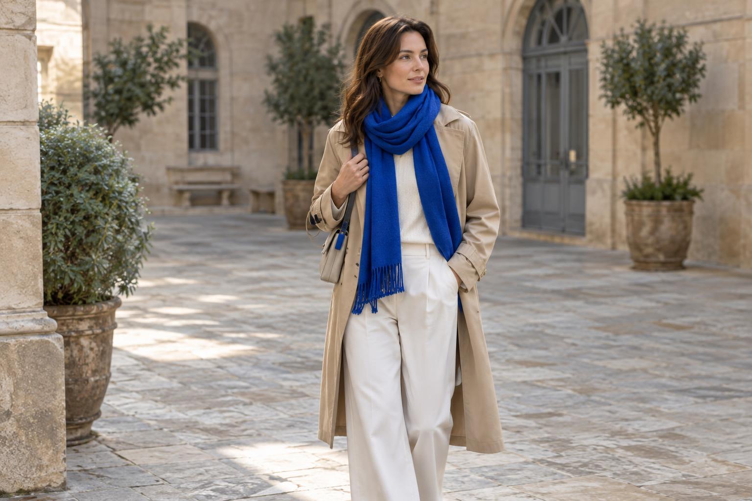
Outfit contrast is the visible difference between the parts of what you wear. A white shirt with black trousers has strong light-to-dark contrast; an ivory shirt with beige trousers has much less. Contrast can also come from color, such as a bright blue scarf against a brown coat, or from texture, such as a crisp cotton shirt under a fuzzy knit. You do not need special color terminology to work with it. Ask yourself which item your eye notices first, and whether you want that item to stand out.
Neither low nor high contrast is inherently more polished. A low-contrast outfit can look relaxed and cohesive, while a high-contrast one can feel crisp and energetic. Those are possibilities, not fixed rules: fit, fabric, setting, and personal taste all affect the result. The useful question is not which type suits you permanently, but what effect would serve you today.
Build a low-contrast outfit with small shifts
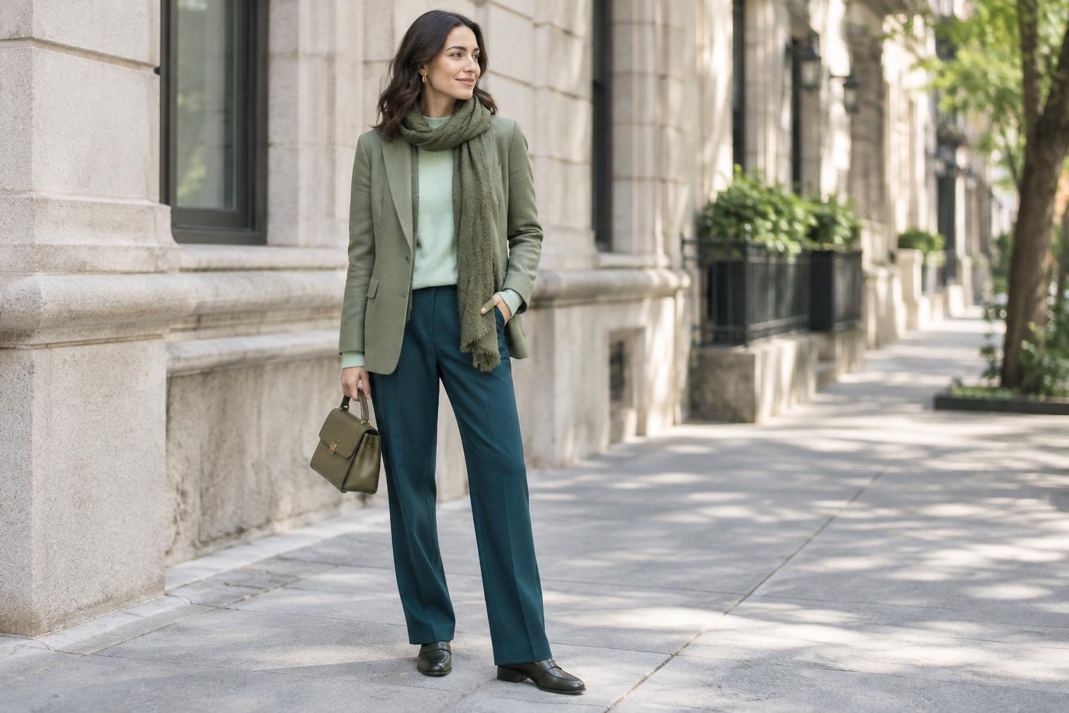
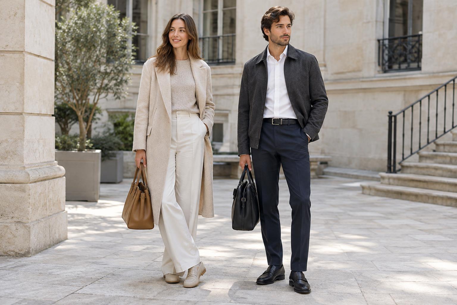
For a low-contrast look, start with pieces that sit close together in lightness. Try an oatmeal sweater with stone trousers, a navy shirt with dark indigo jeans, or a chocolate cardigan over a medium-brown top. The colors need not match exactly. In fact, a slight shift between them can make the outfit look more considered than an accidental near-match. If you are unsure whether two pieces work together, view them in daylight and check that the difference looks intentional.
A blended color palette still benefits from shape and texture. Pair a smooth tee with textured linen trousers, or a fine knit with structured denim. A belt, open collar, or rolled sleeve can add definition without introducing a stark new color. If the whole outfit feels flat, change one material or silhouette before changing the palette. This keeps the quiet effect while giving the eye something to explore.
Use high contrast to create a clear focal point
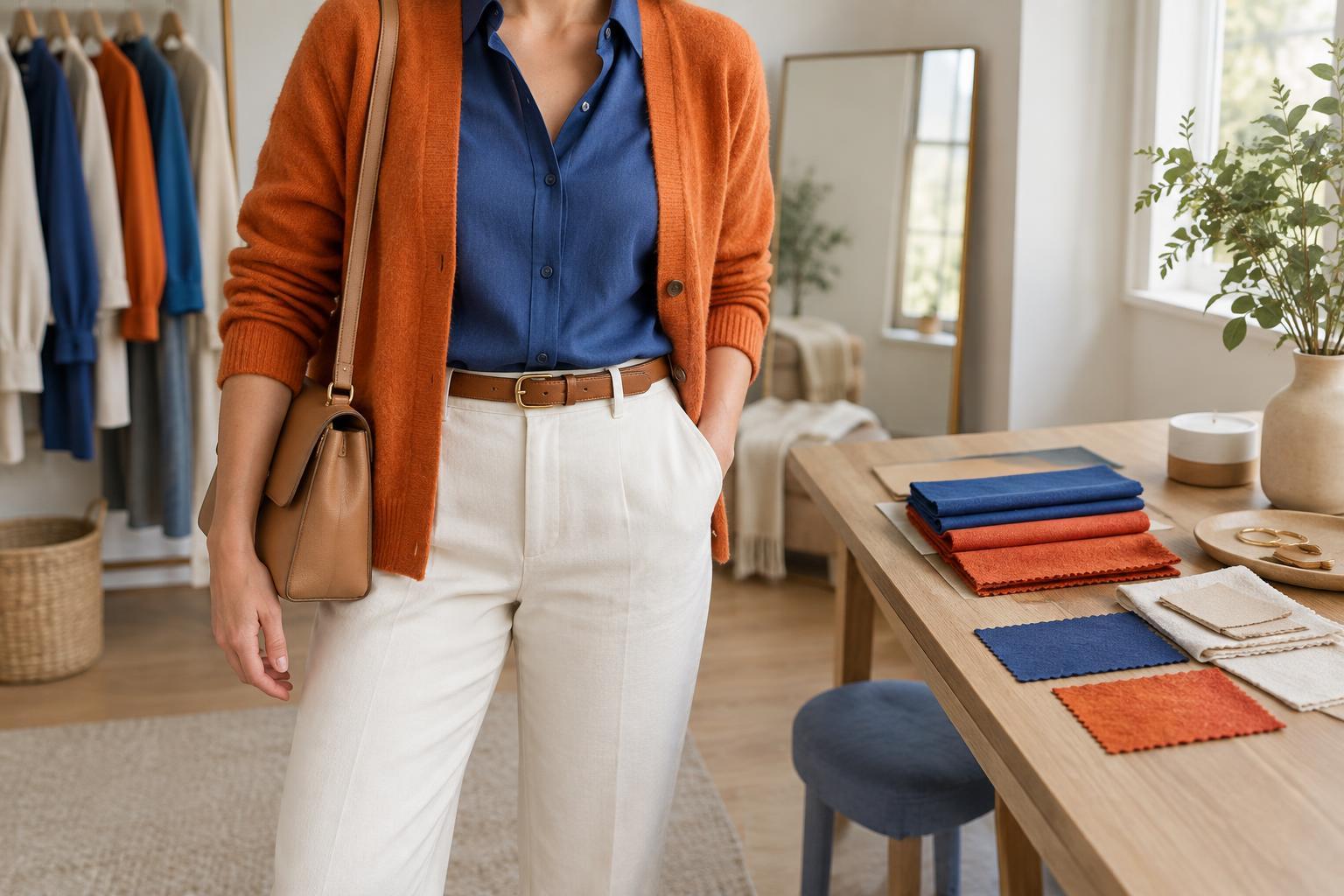
High contrast is easiest to build around one strong pairing. A white tee under a black jacket, a pale blue shirt with dark navy trousers, or a vivid red bag against an otherwise neutral outfit all make a clear visual statement. Decide where you want the emphasis: near your face, at the waist, or on an accessory. You can then keep the remaining pieces simpler so they support that choice rather than compete with it.
Strong contrast does not require bright colors. Light cream against deep charcoal can read as bold, while two saturated colors of similar lightness may feel more blended than expected. If a high-contrast combination feels too abrupt, add a connecting detail. Shoes that echo the darker piece, a patterned scarf containing both colors, or a mid-tone layer between them can make the outfit feel deliberate without removing its energy.
Adjust the contrast without changing your wardrobe
The same clothes can produce different effects depending on how you combine them. Consider a white shirt, dark jeans, and a tan cardigan. Worn open, the cardigan frames a striking white-and-denim pairing. Button it over the shirt so only a little white shows, and the overall impression becomes softer. Switching dark shoes for tan ones changes the balance again. Small styling decisions can matter as much as buying a new color.
Accessories offer a low-commitment way to experiment. A light bag against a dark coat adds a distinct focal point; a bag close in color to the coat blends in. If you like color but not a large block of it, try a scarf, socks, or a visible layer at the neckline. Notice what happens when you repeat that accent once elsewhere. Repetition can make even a playful combination feel connected.
Choose for the day, not for a rule
When getting dressed, think about your setting and what you want to emphasize. A low-contrast combination may suit a day when you want an easy, continuous look; high contrast may help a simple outfit feel more defined. Neither is restricted to a particular season, occasion, or type of person. Your own coloring can influence what you enjoy wearing near your face, but it does not have to dictate your whole outfit.
Try laying out two versions using pieces you already own: one with colors close in lightness and one with a clear light-dark difference. Take a step back and compare the overall impression, not just the individual items. If one version feels almost right, adjust a single element before starting over. Contrast is a flexible tool for directing attention, and the best choice is the one that helps your clothes express the mood you intended.