Start by noticing what feels off
A color combination does not have to follow a strict rule to look good. Often, though, an outfit feels unsettled because its colors send mixed signals. One piece is much brighter than everything around it, two similar shades look as if they were meant to match but do not, or several accessories compete to be the first thing you notice.
Before changing the whole outfit, look at it from a few steps away. Which item catches your eye first? Does another item seem to argue with it? Is there a color that appears only once in a small, conspicuous spot? These questions are more useful than asking whether two colors are universally allowed together. They help you decide whether to balance the outfit, create a clearer contrast, or remove one distraction.
Mistake one: mismatched color intensity
Intensity describes how vivid or muted a color looks. A vivid cobalt shirt and a dusty sage skirt may both be appealing, yet together they can feel uneven: the shirt demands attention while the skirt quietly recedes. The answer is not necessarily to replace either piece. You can give the bright item room to stand out by pairing it with a calm neutral, such as charcoal trousers, and save the sage skirt for softer colors.
You can also bridge the difference. A medium-blue layer between a bright blue top and muted bottoms makes the change feel more gradual. Alternatively, repeat a small amount of the brighter color in an accessory. This works best when the repeated color supports one clear focal point rather than creating a second one.
Compare colors in the light where you are getting dressed, then check them again near a window if possible. Fabrics with sheen can look more vivid than matte fabrics in the same hue, while a textured knit may make a strong color seem softer. Judging the clothes together is more helpful than relying on the color names on their labels.
Mistake two: accidental near-matches
An almost-match can look unintentional when two pieces occupy a large part of an outfit. Imagine a warm cream sweater with cool white trousers, or two navy items that differ just enough for one to look faded beside the other. The shades are not wrong together, but a viewer may expect an exact match because they are so close.
One fix is to separate the similar colors with a distinct third shade. A brown belt between the cream sweater and white trousers makes their difference read as a choice. Another is to increase the contrast: swap one navy piece for light blue, charcoal, or another color that clearly has its own role. If you want to wear the near-match, try repeating both tones elsewhere in the outfit so neither looks like an isolated mistake.
Material can make a near-match easier to wear, too. A crisp cotton shirt and a chunky knit may look deliberately varied even when their colors are close. Two smooth pieces in slightly different shades are more likely to invite direct comparison. When shopping for an exact-looking set, compare the items side by side rather than assuming that a shared color name means they will match.
Mistake three: too many focal points
A focal point is the feature that draws your attention first. A patterned jacket, bright bag, colorful shoes, and striking scarf can each work well on its own. Worn together, they may leave the eye with nowhere to settle. This is especially noticeable when the colors are widely separated across the body and none is repeated or grounded.
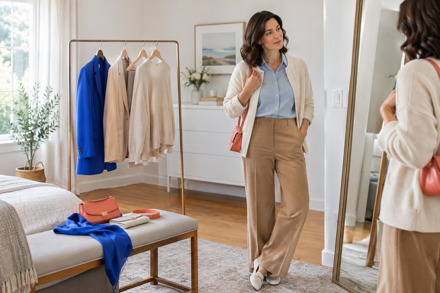
Choose one item to lead, then let the others support it. With a multicolored scarf, for example, pull a quieter shade from its pattern for your top and keep your bag neutral. With red shoes, consider a small red detail near the face rather than adding a second large red item. Repetition can create a connection, but the repeated pieces do not need equal visual weight.
This does not mean every outfit needs to be subdued. If you enjoy several bold colors at once, give them a shared structure: similar intensity, a limited group of colors, or a neutral layer that creates space between them. The aim is for the outfit to look lively on purpose.
A quick color check before you leave
If an outfit is not quite working, make one change at a time. First, identify its intended focal point. Next, check whether any other piece is unexpectedly brighter, shinier, or more patterned. Then look for shades that nearly match and decide whether to match them more closely or make their difference clearer. Finally, step back and see whether the colors feel connected across the whole outfit.
Treat these checks as options, not rules. A near-match or an unexpected clash can be part of a distinctive personal style. What matters is whether the result reflects what you meant to put together. Small adjustments, such as changing a belt, swapping a layer, or choosing a quieter bag, often do more than rebuilding an outfit from scratch.